The Need
RQM+ approached Ruder Finn to help refresh its brand identity for a more modern look and feel in the digital age as clients are moving towards digital transformations and solutions within the medical device industries, and reflect a seamless integration with the new solutions and services acquired. There was a disconnect with employees’ understanding of the “plus” in the company’s name, and a need to clearly communicate its meaning and significance to the brand.
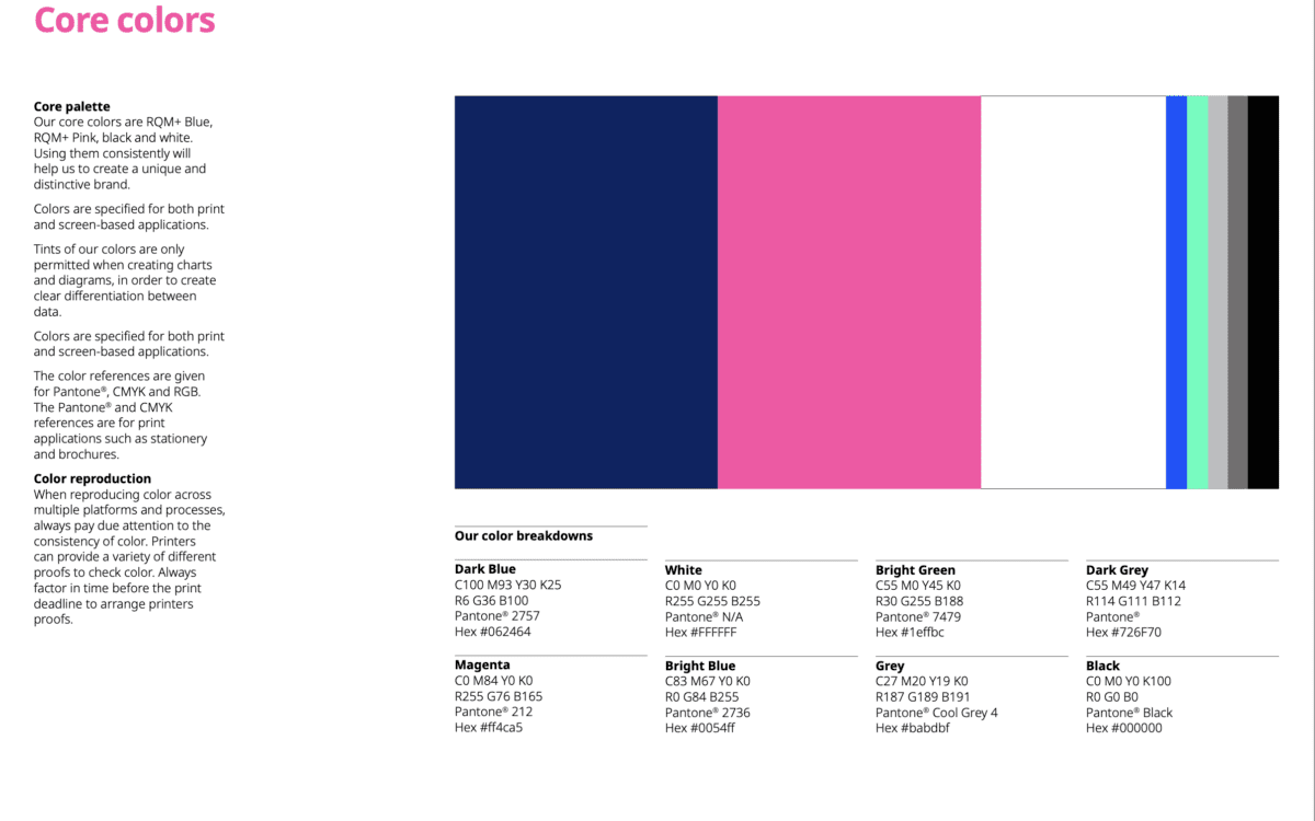
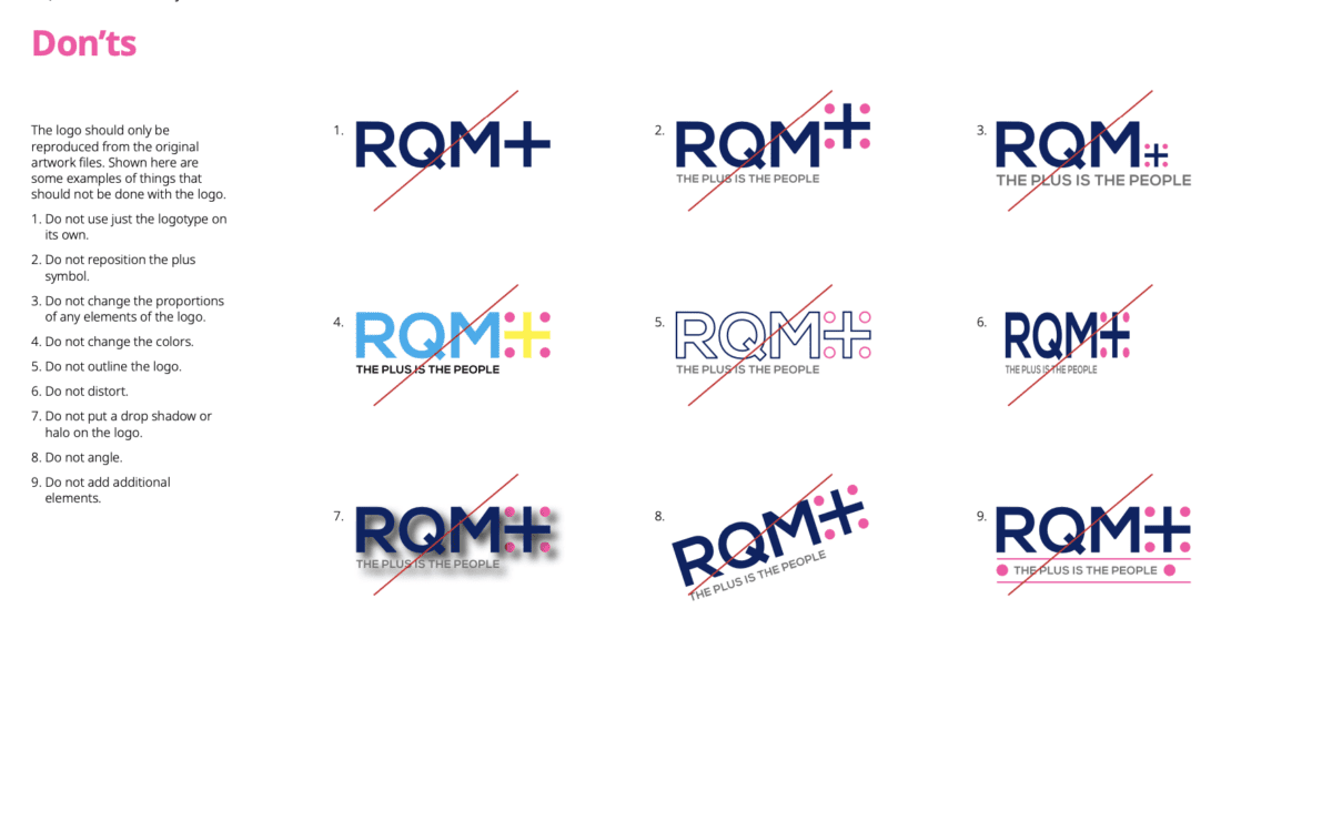
The Plus is the People
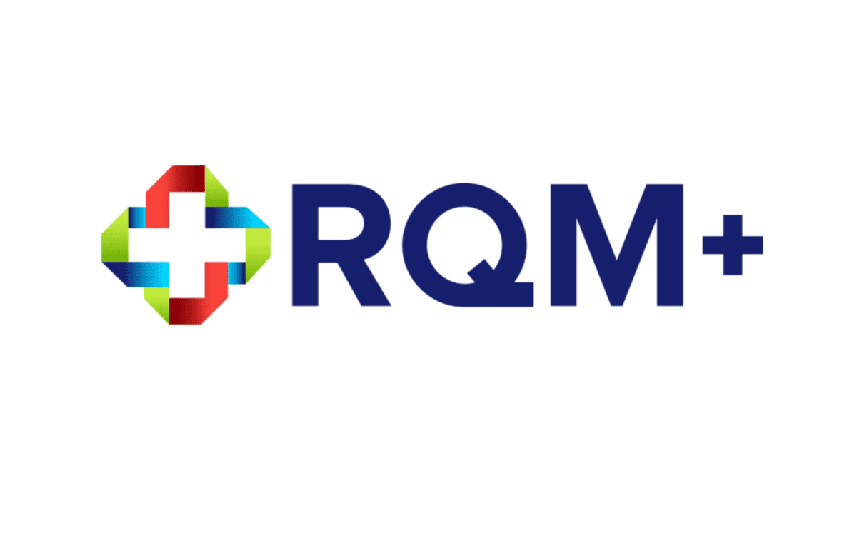
Our team strategically advised to refresh the plus in RQM+ with the tagline, “The Plus is the People,” and developed a new logo, corporate narrative, mission statement and messaging framework to reflect this shift of focus onto the talent and expertise of employees that instilled a sense of pride and energy across the company.
Approach
To support rollout with employees and key stakeholders both internally and externally, we produced a series of videos showcasing leadership from all levels of RQM+ to communicate what the new branding means for teams at the enterprise level, as well as business unit levels, to achieve the company’s new mission: helping clients navigate the complex product development and regulatory landscape in order to bring innovative, safe and effective medical technology to the patients who need them.
The videos were rolled out through employee town halls and social media campaigns on RQM+’s LinkedIn channel, and Ruder Finn supported the client with counsel for launching a redesigned website to reflect the new branding.